Decision-making gets easier when we present complex data in a comparison format. By comparing ideas, convey many ideas in a concise format. Effective comparing goes well through using charts, tables, images, and bullet points. In this way, the audience understands concepts in a visually appealing manner. Comparison slides prove fruitful when consistent and professional slides are the requirements.
They significantly impact the audiences' understanding of concepts and retention. To convey data narratively, visuals and graphics assist with comparison slides. So, in this article, you will learn to make effective comparison slides. Also, the best 5 comparison PPT templates will make your presentation stand out.
In this article
Part 1. What are Comparison Slides?
Comparison slides show similarities and comparisons between two items and opinions. They are a type of slide that provides a visual framework to compare information. In such slides, arrange various sections and columns to show two alternatives. This way, the audience can grasp the key distinctions and make content digestible.
Simplicity in comparison slides encourages viewers to read and understand the ideas. Also, it reduces the risk of overwhelming the audience with information. Visual clarity, in comparison, can evaluate pros and cons to assist in decision-making.
Part 2. Three Elements of an Effective Comparison Slide
Certain elements play a vital role in comparison slides to facilitate effective understanding. Such elements ensure that text content remains clear and no ambiguity remains. Thus, we have discussed three important elements below for an effective comparison slide:
- Header and Title: Each column, section, label, and subheading contain a clear title. In reality, the title sets the stage to make the audience brainstorm about the topic. It provides the audience with contextual details of items that are being compared.
- Visual Elements: Compel appropriate color coding to show associations or contrasts. Besides, use elements like tables, graphs, charts, images, and stickers. Also, icons like arrows, stars, and checkmarks indicate the text's significance.
- Labels and Legends: Multimedia proves inefficient without a proper description. Thus, labels and legends play an effective role in making the slides informative. Furthermore, they assist viewers in drawing conclusions from the data.
Part 3. Best 5 Comparison PPT Templates
Comparison templates provide a framework to present data into groups. They show alternatives with prototype comparison, tape chart, and simple arrow comparison. To use such elements in comparison slides, you can use pre-designed templates. Find the 5 best comparison PPT templates for making your presentation breathable.
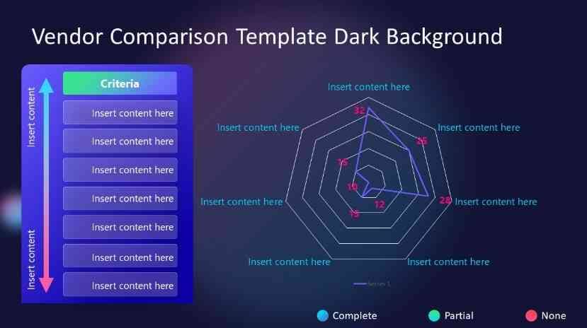
1. Vendor Comparison Table PowerPoint Template
Businesses use comparison templates to link merchant on their credibility. This template offers two layouts: a spider chart and a double arrowhead table. The spider chart compares various factors with editable features and an Excel attachment.
The arrowhead table can be used for custom evaluations such as pricing and features. Customize the small colored circles with the provided key and legend. Also, the two slides with different color schemes can be further enhanced by altering colors and fonts.
2. Amazing Comparison PowerPoint Presentation Template
This comparison PPT template is great for clearly showing numbers and percentages. In the middle of the slide, you can list up to 7 things you want to compare in the white column. Around it, there are 7 lines you can color to show if things are good or bad. There are two hexagons for titles and explanations to compare products easily.
Users can give valuable insights to your audience by making the technical process easy. It makes sharing and comparing numbers simple for agenda and data analysis presentations. The PPT format of this template is available in different ratios.
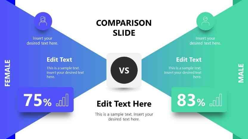
3. Modern Comparison Slide Template for PowerPoint
Modern tools are used to show the contrast between the two entities in this template. The shadows and colors give it a 3D look with customization options. There are two different slides with black-and-white backgrounds to choose from. The first shows two triangles with intersecting lines to symbolize titles, icons, and text boxes.
It comprises two completely editable slides, and you can pick one as required. One slide shows two triangles crossing in the middle, comparing men and women. The second slide is similar, with separate placements of icons and different images.
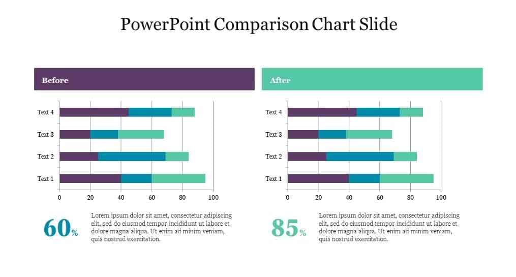
4. PowerPoint Comparison Chart Slide
A chart can best represent a company’s brand comparison with compelling results. This comparison slide features a two-node bar chart design with a white color scheme. In such a way, you can make complicated stuff simple by crossing it on a different axis. Also, users can customize the chart's color scheme that best suits their preferences.
It simplifies the comparison between two items and shows after-before results. A chart description can be written below them and mention larger statistical data there. The chart slide is available in 16:9 and 4:3 format, and you can download it in PowerPoint format.
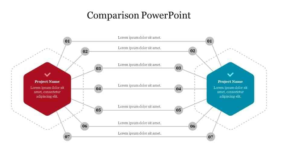
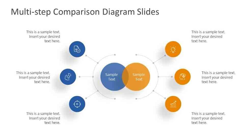
5. Multi-step Comparison Diagram Slides for PowerPoint
For marketing and financial strategy, make comparisons among products and revenues. This template contains up to 18 slides with three main diagram designs. Using this, show variations of your results with different color scheme options. These 3 diagrams make it easier to link product comparison with the audience.
The diagrams show circles and text boxes to present your data in a simplified manner. These slides can be downloaded in PowerPoint and Google Slide with a 16x9 size. You can use them for all business presentations, showing what's good or bad about something.
Bonus Tip: Improve Your Comparison Presentation with Presentory
With comparison slides, make your audience familiar with facts and figures. It may sound like a difficult task, or viewers might get bored with conventional templates. This is where Wondershare Presentory enters to make your presentation breathable. With its innovative AI features, you can input your information in an organized way.
This presentation maker offers pre-designed layouts with appealing visuals. You can add different animations and effects to enhance the presentation-making process. It lets you connect with the audience through different platforms, expanding your reach. Not only this, but you can have an AI-generated presentation outline for comparison.
Key features
- AI-generated Outlines: With this tool, you can have AI-generated text with a command. It will make a presentation outline with many options for refinements. The tool will regenerate the result if you don't get the desired results. Afterward, it will be added to the slides with an automation process.
- Rich Resources: This presentation maker gives you access to a rich resource library. These resources are used in every industry, from business to education. Users can change the text style or insert virtual backgrounds. Moreover, you have an option to add stickers, characters, and numbers to the slides. Overall, import your PPT and elevate your presentation using this AI tool.
- Cinematic Effects: The quality of slides can be enhanced with animations and transitions. In the slides, set an action with animations like appear, disappear, or rotate. Users can alter the background with classical indoor, cartoon, solid, and gradient colors. Moreover, there are also unique transition effects for smooth slide changes in the presentation.
- One-Click Connectivity: Stream with your friends and colleagues on various online platforms. It lets you connect virtually on different platforms like Zoom and Google Meet. While streaming, it enhances your facial features with makeup and removes blemishes. Besides, this AI tool also allows you to record the tutorials with audio.
- Teleprompter: This AI tool enables you to insert scripts and read while presenting. Using this option, you can change the text's color, size, and alignment. Moreover, it allows you to minimize or maximize the script as per your readability. During the presentation, play the teleprompter content and get automatic text scrolling.